Carousel(ed) exposed filters
Or, how to save space in your search pages
Problem narrative
A friend of ours, Mr Siteb Uilder needs to expose some filters to the visitors of his website
He knows how to use Views and he knows how to configure and expose filters.
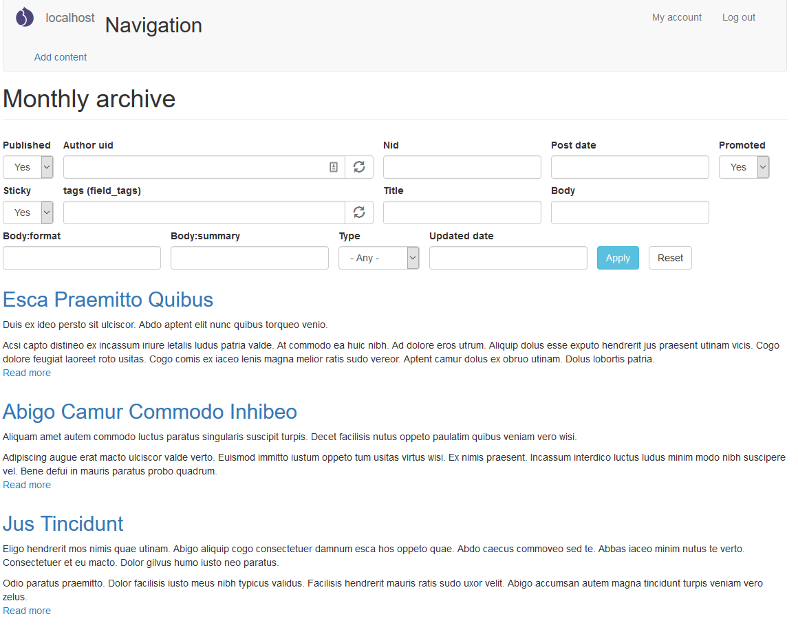
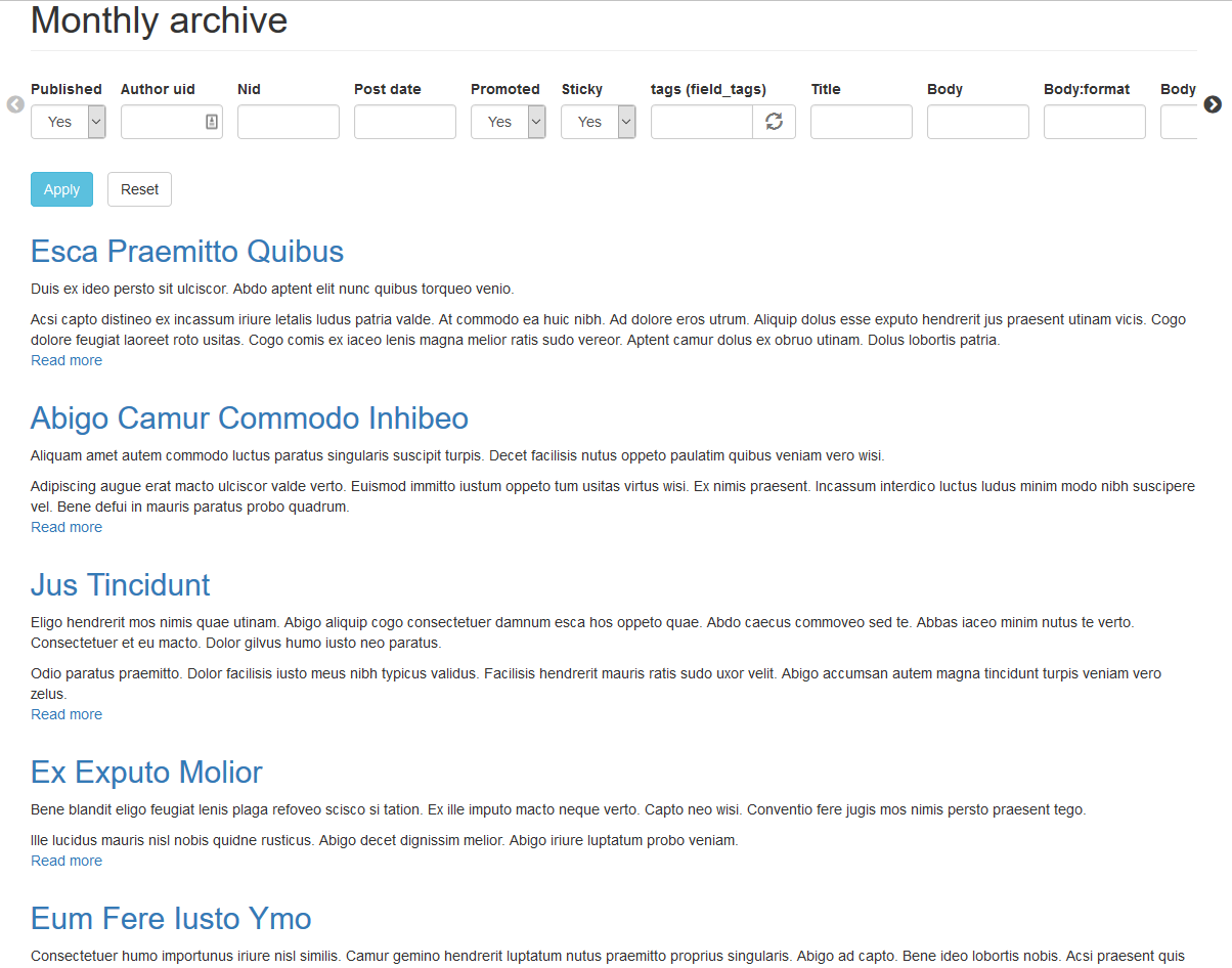
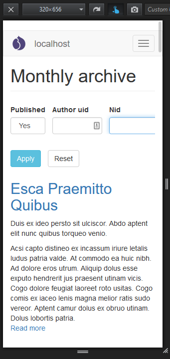
He happily clicks away for a couple of hours and finally gets this...
on his desktop
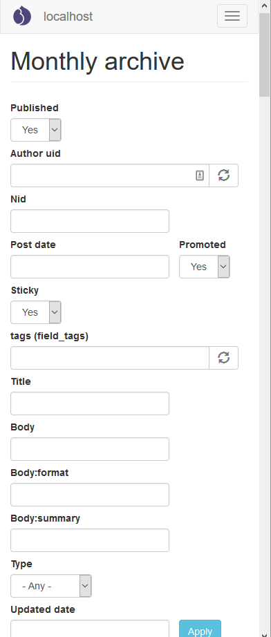
and on his mobile
and you have probably seen this
Reality check
- Problem 1: The visual appeal of a screen clattered with small widgets is far from exceptional.
- Problem 2: As a consequence, the provided UX is also suffering.
- This is the part of a project where a front-end developer needs to step in.
- A UI designer could also be helpful.
- All these, provided that the project's budget and plan predicted them.
- Moreover, there is that lingering promise, that you get lots of goodness out of the box.
- Actually, you don't. But, there are some alternatives. Read on!
A simple receipe that may help
- Let's wrap exposed filters in a carousel, using the horizontal axis to reduce use of the vertical space.
- Inspiration: Visit google.ch on your mobile phone and try (to find) and use the search filters.
- Ingredients:
- We can use the VEFL module to distribute our exposed filters into regions.
- And a carousel JS library to turn one or more of our regions into a horizontal/responsive/cool filter carousel.
Carousel libraries
Flickity: http://flickity.metafizzy.co/
Slick: https://github.com/kenwheeler/slick/
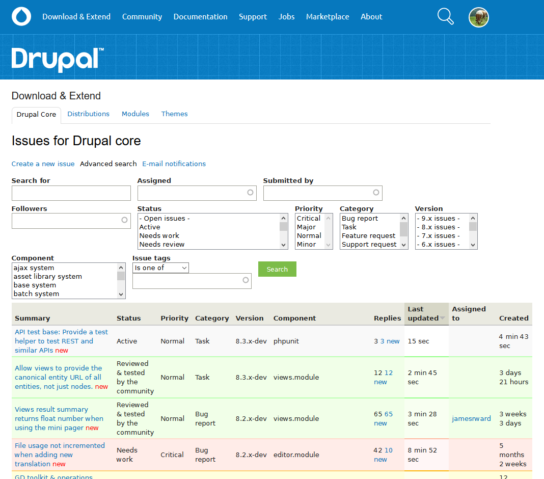
What it looks like on your desktop
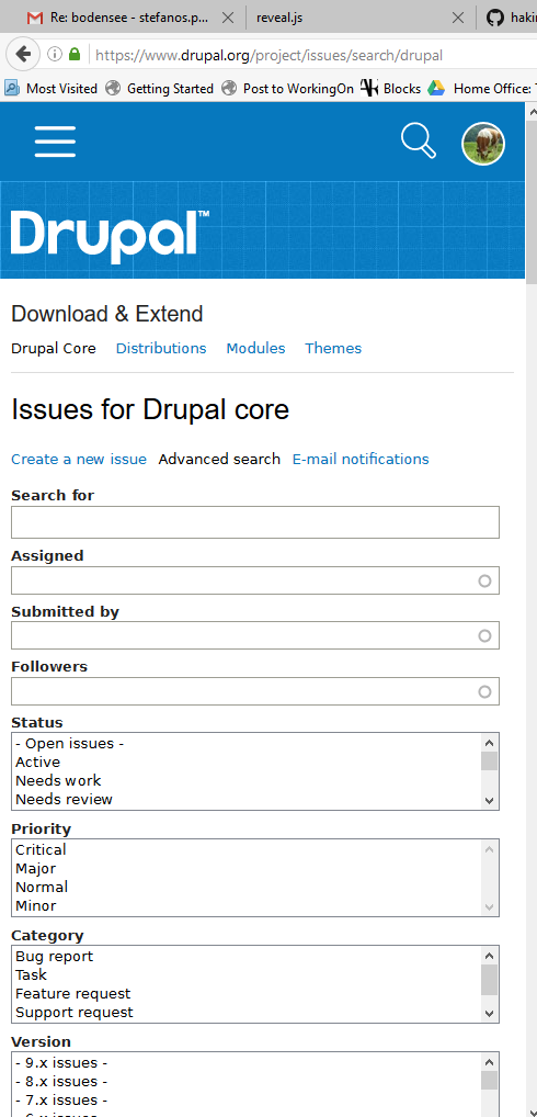
What it looks like on your mobile
Varia
- A great contrib module for managing exposed filters layouts: VEFL (https://www.drupal.org/project/vefl)
- UX Notes:
- Problem 1: The filters are hidden; user doesn't know a filter exists unless she looks through all the carousel options.
- Problem 2: Which are the active filters at any given momen?
- Problem 3: Still needs some styling to get it to look right.
Thank you!
A receipe by https://petrakis.design
Put it in the oven,
bake it!
En guete!